
Introspective Typographia
Tech

Water
Carbon Dioxide
Measures
Phosphates
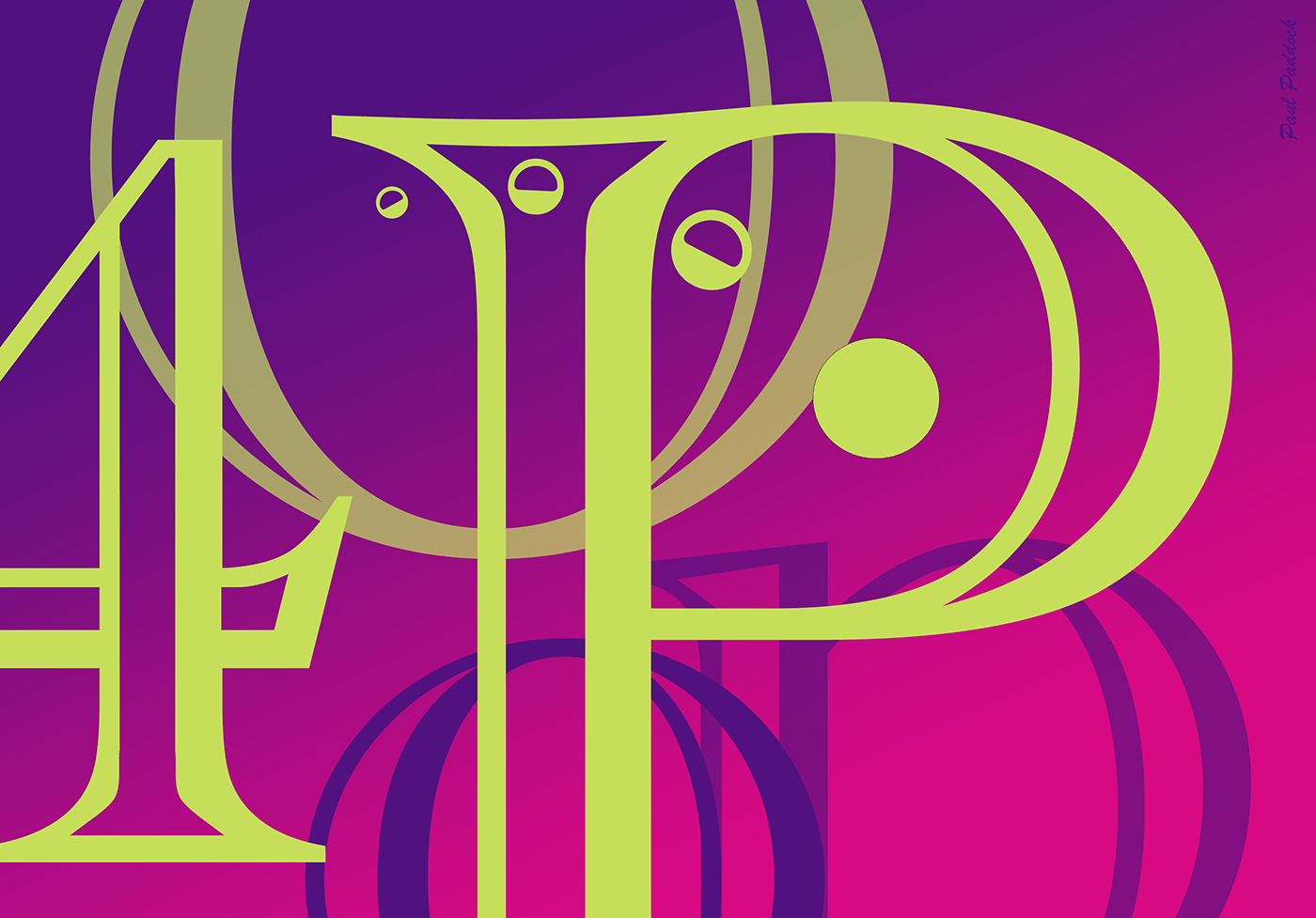
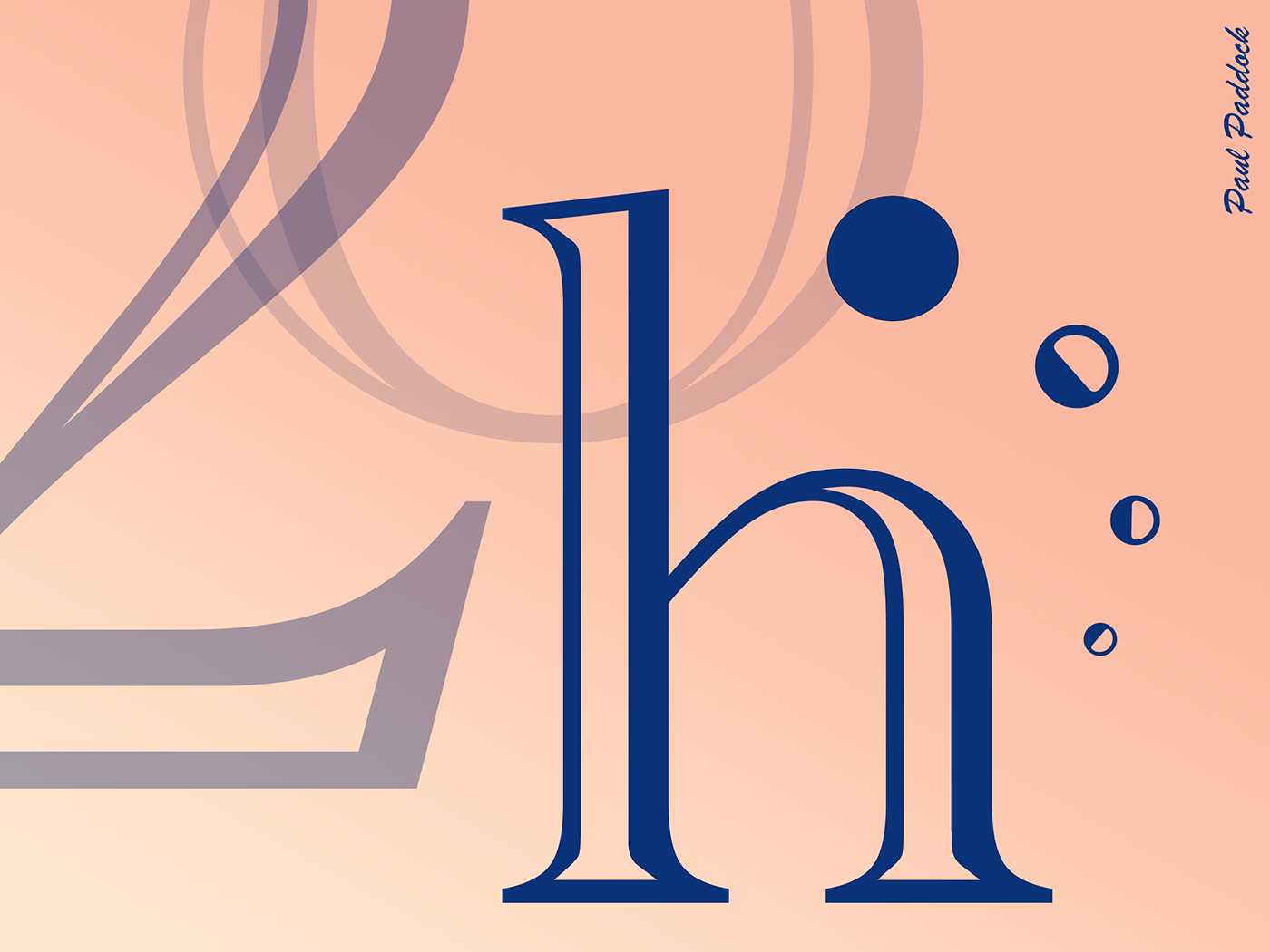
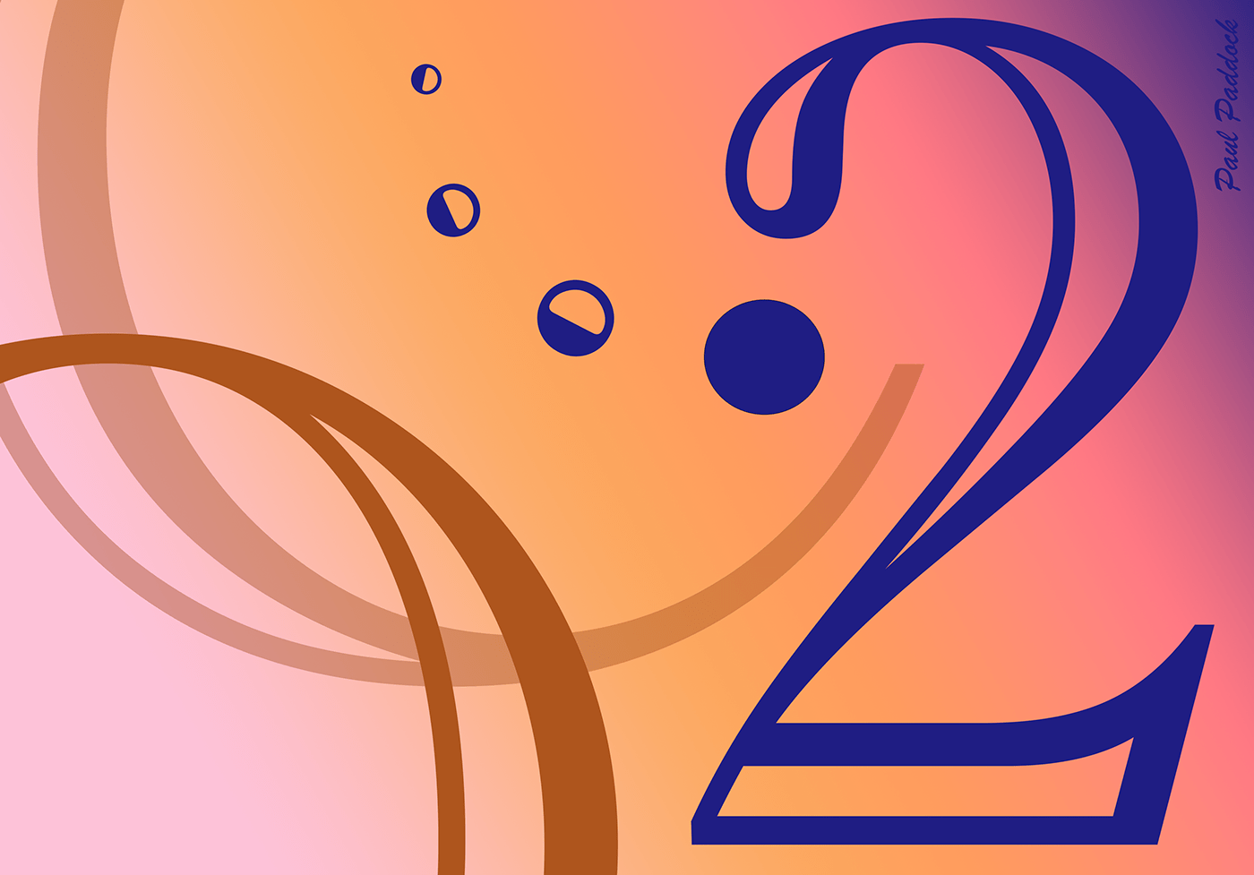
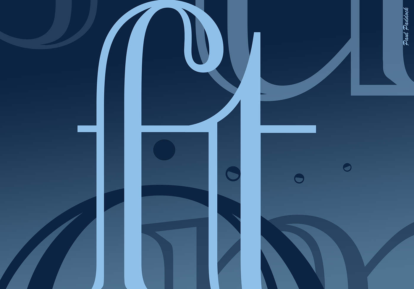
Random color & gradient-based graphic sample pieces exploring perspectives while contemplating some of the more common everyday formulas as part of life--be they chemical or otherwise--as some pieces of interpretations or musings of the world around me. I'll be adding more in due time. Note the subtlety and ambiguity of each letter use in space. Each color has a relationship--either thematic or relative to the gradient; each letter has varying shades to hint at proximity, consciousness, and focus. For example, the 'Phosphate' piece led me to think of phosphorescence's pinkness, even though phosphorus by itself and phosphates are completely different chemical makeups. I chose the element's color to build upon and explore different visual relationships tying it together. In all pieces, I input the common theme of the 4 dots hinting at motion; the atmosphere is not static, but fluid, percolating at times. The solid dot could be you while the other 3 dots trailing suggest where you've been as you're going through the different parts of life. Atmosphere of water in the 'Water' piece, atmosphere of the world of technology in the 'Tech' piece (note, I chose to focus on the phonetic lettering - 'Tek' for that piece, more to the point I guess), the atmosphere of CO2 in the 'Carbon Dioxide' piece, yep you move through that; it's unavoidable. The 'Measures', 'Phosphates', and 'Tech' pieces have a little more complexity in design compared with the others because I hinted at their complexities in nature; they have more happening with them, conceptually. The 'Measures' piece particularly has a lower case f & t in the foreground reflecting the 'feet' abbreviation with lower case m ubiquitously in the far-background (with some pieces of m split and upside down, or u's floating) giving the idea that, though we Americans stand by our Imperial units and think they're superior (solid, focal f-t), really the Metric system is the true grandaddy, has been around a lot longer, and is more universal (transluscent m's, u's in the background; we can't ever forget!). I could go on, but I leave much interpretation up to you.


